Redesigning MyNames' Login Flow Published Fri Aug 22 18:00:00 SAST 2014
I originally modelled the MyNames' login screen after that of Amazon. My assumption was that millions of people would be familiar with their login/register flow and that the e-commerce behemoth must have spent thousands of dollars on user-testing to optimise conversion for their thin margins. I was wrong:
Behold, Amazon's Sign in Page

Working from that, I ended up with what was the original MyNames login screen.
Old & Complicated

Yuck. There's a lot going on, but it worked, for a while.
Let's break up the two main ideas of logging in and signing up into clearly contrasting tabs.
New & Clean
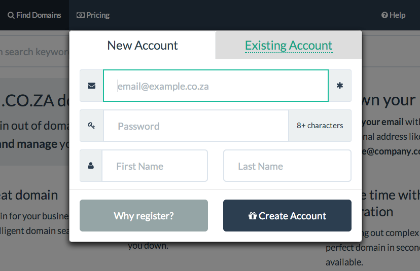
There are a number of usability considerations:
- Right-align the primary action, which is consistent with left-to-right reading in Western countries
- Sufficient contrast between active and inactive tabs
- Helpful placeholders
Already have an account?

We think this format places less cognitive load on the user. Do you think the new design is cleaner?